
Your Daily
what i did
ux/ui design
user research
competitive analysis
wireframing
prototyping
branding
the result
Through extensive research, ideation, and testing, my team and I designed a "future" concept of Your Daily that offers intuitive navigation, integrates a sense of community, and delivers a personalized user experience.
Using a wide variety of tools and resources, Your Daily provides a holistic approach to learning and coping with autoimmune conditions. Their program is purposefully curated to easily fit into one's busy schedule.
For most autoimmune conditions, there is no cure; some require lifelong treatment, while others can rely on lifestyle choices and diet to ease symptoms and reduce flare-ups. Learn more about autoimmune conditions here.
Your Daily is a personal coaching app for women living with autoimmune conditions, helping them build small, yet meaningful daily habits to heal the nervous system.
my team
austin — ux designer
vlada — ux designer
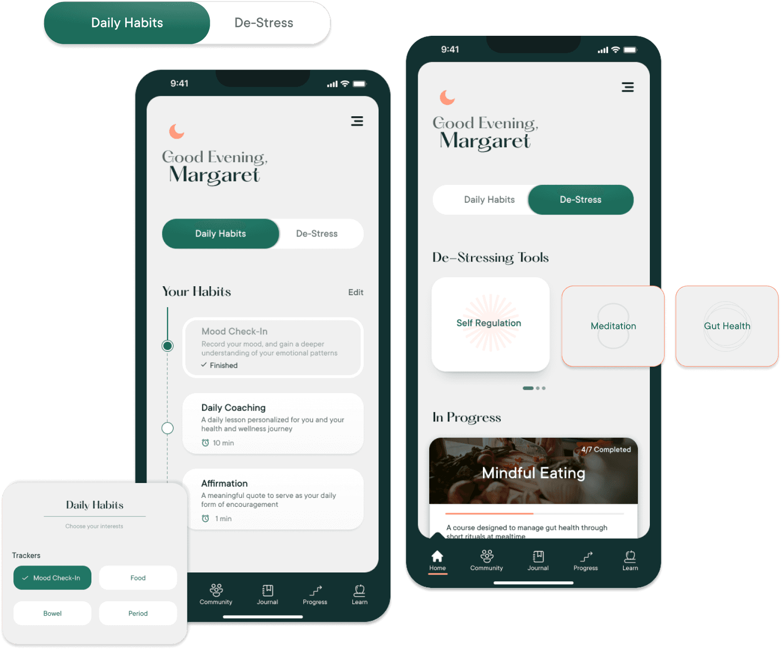
home screen
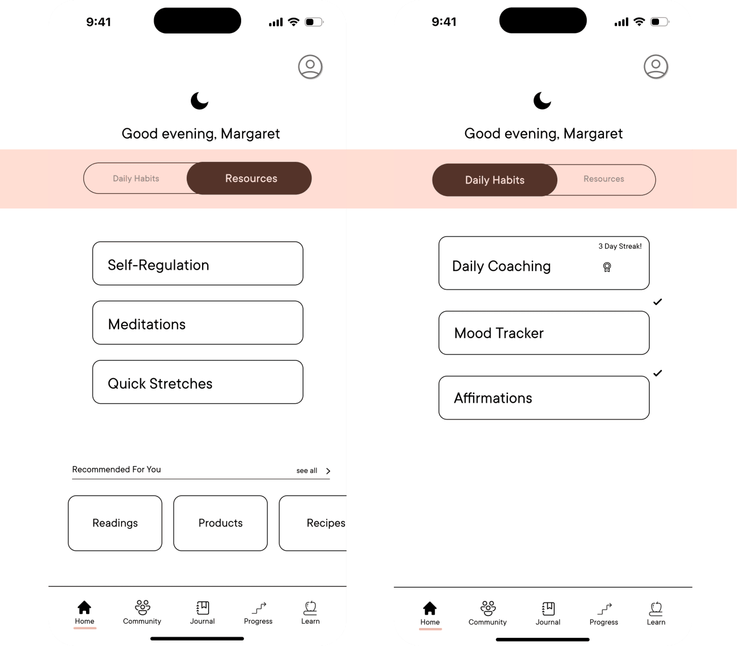
The home screen utilizes a toggle to simultaneously control visual clutter and allow easy access to other tools and resources.
'Daily Habits' are customizable, providing the ability to choose what you want to prioritize in YOUR personal coaching program.
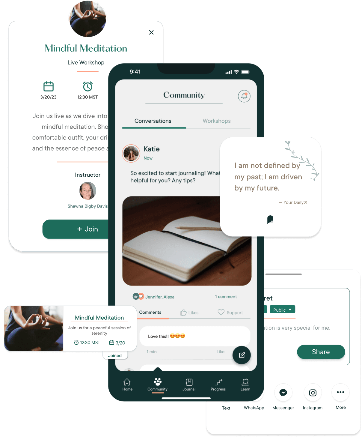
community
Interact within a supportive community through workshops, both in person and online, or share posts for others to see, learn, and appreciate.
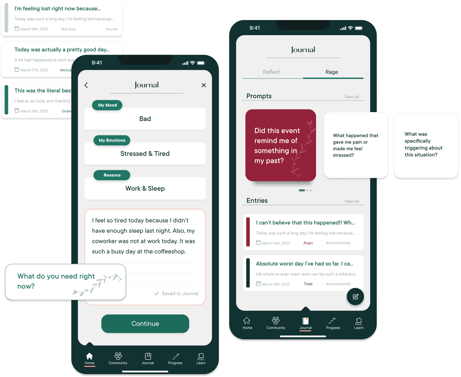
journaling
Whether you feel like reflecting or raging, you can do so right in the Your Daily app.
You can even journal from inside the Mood Tracker, allowing you to see how you were feeling that day when looking back at old entries.
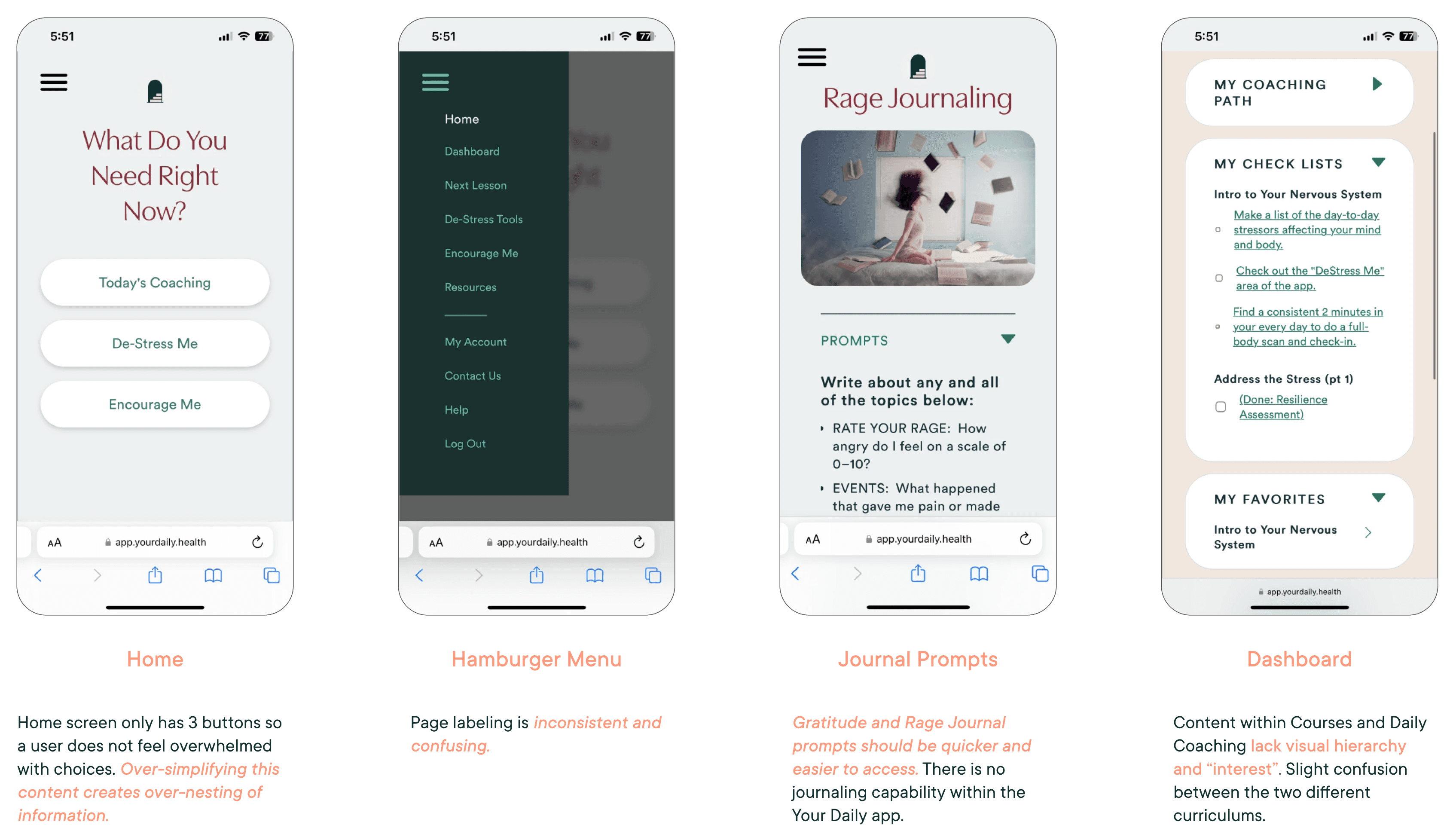
the current Your Daily experience is
unintuitive to navigate, lacks a sense of
community, and feels generic.
the problem
the current Your Daily web-app:
We conducted 9 interviews to better understand who our target users are, prioritizing finding participants who identify as:
— a woman living with an autoimmune condition(s)
— a woman who cares about personal health and self-care
— someone currently using/has used a health and wellness app
— current user of Your Daily
interviews
Users want to be able to reflect on their progression, learn more about their autoimmune condition(s), and feel a sense of belonging within a relatable community.
"In terms of community, feeling seen and heard is very important to me…"
Kaasha, 41
"I use journaling, lessons, and de-stress tools to calm my anxiety, burnout and stress."
Elissa, 70
"I feel like there isn't enough known about autoimmune conditions…"
Lauren, 22
market analysis
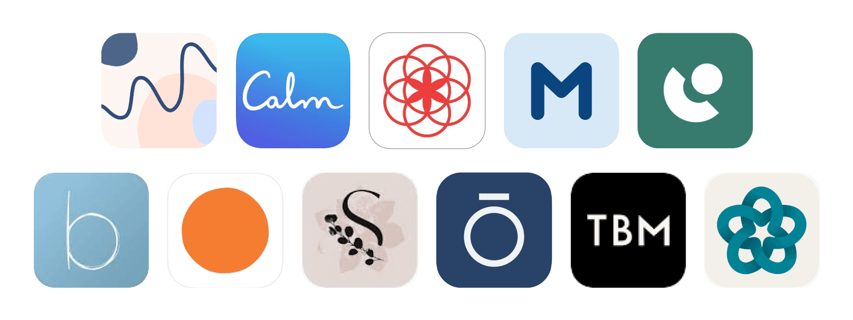
Among the 11 different health and wellness apps, common features included mood tracking, journaling capabilities, and a strong sense of community.
Majority of the apps we analyzed did not primarily focus on autoimmune conditions; instead, they had a broader emphasis on general health and wellness.
redefining our target user
Your Daily initially targeted busy working women, specifically C-suite executives in their 30s to 40s, living in bustling metropolitan areas.
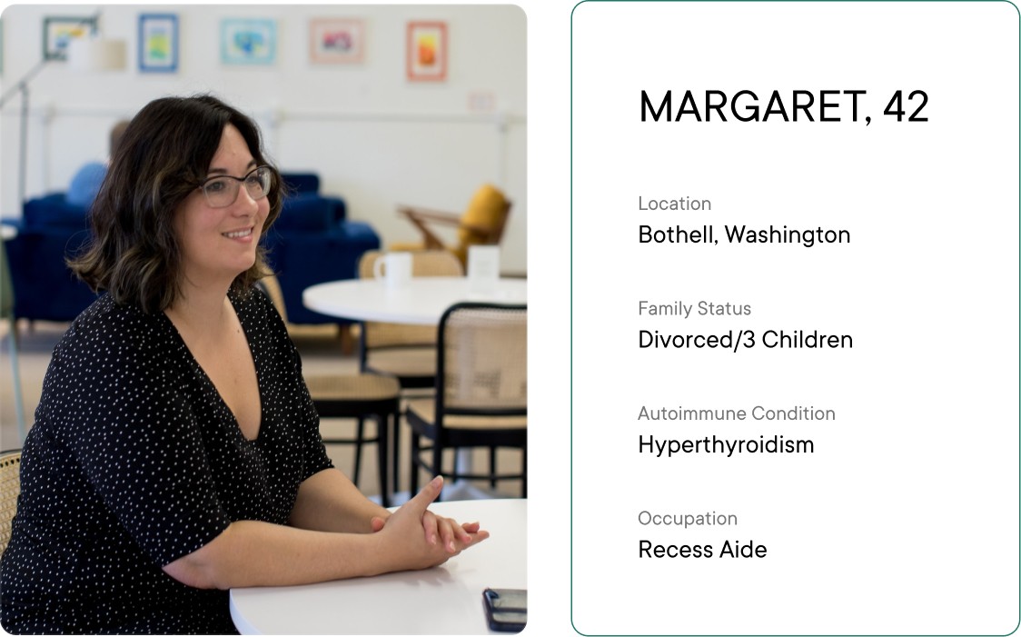
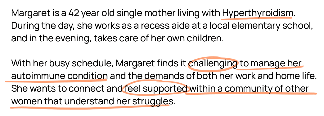
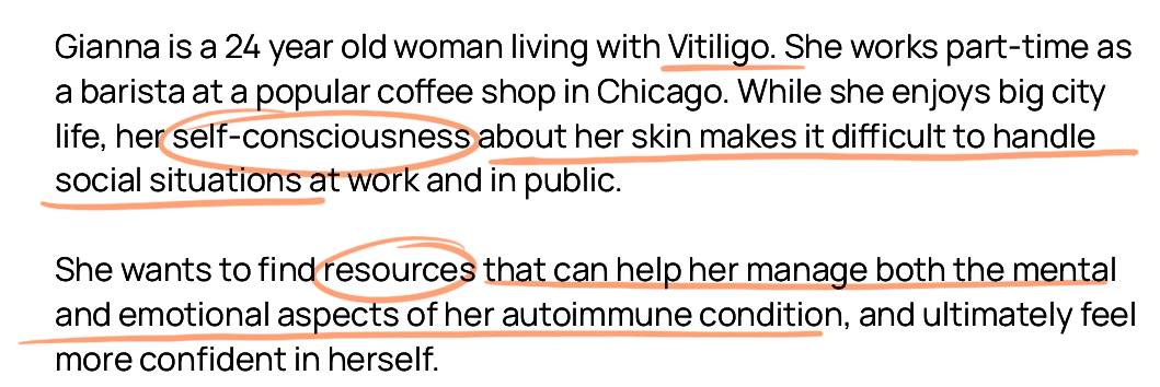
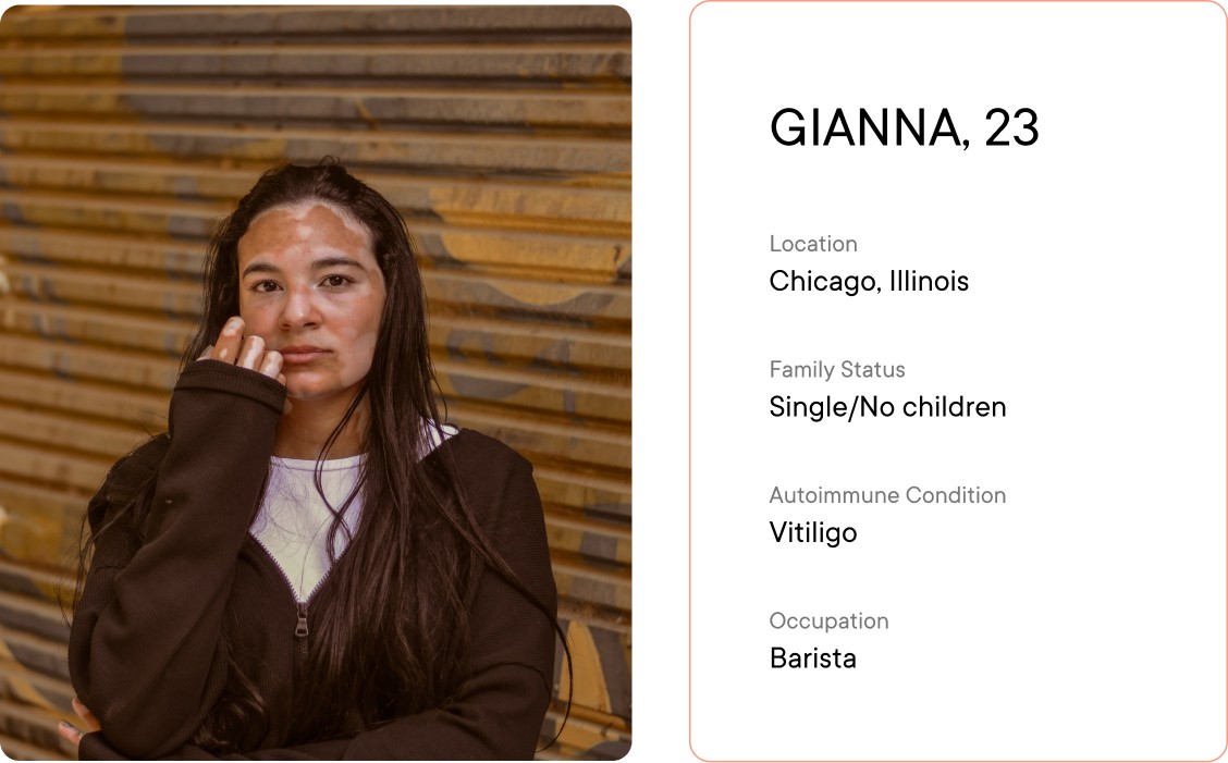
This made it difficult to appeal to a younger demographic, as well as be accessible to a wide range of users. Using our research, we created two new personas that better align with Your Daily's business goals and project goals.
Their initial target audience was very limiting and conflicted with Your Daily's overall business goals.
new personas

implement ways to make information about autoimmune conditions more accessible?
create a space for women with underlying health conditions to feel understood and connected with each other?
motivate people to include small yet impactful habits into their daily routine?
how might we
Finding the balance between visual simplicity and inclusivity of Your Daily's content.
The home screen is the first page users see when they open the app. It was a priority to keep the interface free from visual clutter to avoid overwhelming the user.
I designed a home screen option that incorporated a toggle; This allows more information to be on the home screen without over-nesting, and provides the user easier access to other tools and resources.
home screen ideation
visual design

final design

retro
It was an amazing experience working with teammates that had so many great ideas, and a client that was very communicative and involved when we needed them to be. It felt rewarding to see how the Your Daily app could be re-envisioned, in a way that improves the overall experience, as well as exceeding well-beyond our client's expectations.
Throughout the process, I pushed myself to embrace ambiguity, navigating the challenges that came with it. I also enjoyed taking on a variety of roles, from research, to prototyping, and branding. If I were able to do this all over again, with more time and resources, I would've loved to run workshops with the original app, and have users perform a diary study for more in-depth insights.
Thank you to Shawna for working with us and letting us be super creative with Your Daily!